Popular lollipop brand Chupa Chups was founded by Spaniard Enric Bernat in 1958. The brand is part of the Italian multinational Van Melle (this company also possesses other famous brands, such as Mentos, Smint or Fruitella).
As happens more often to famous brands, the Chupa Chups logo has quite a nice history:
Enric Bernat: "I saw something tasty that wasn’t very convenient for our most important consumers: children. Their hands got sticky, causing them to get in trouble with their parents. So I put the candy on a stick.”
Bernat called the product 'GOL' (‘goal’ in Spanish). In his imagination the candy was like a football and the open mouth like a goal. The product didn’t sell well at first. Bernat hired an advertising agency, that came up with the brand ‘Chupa Chups’ (taken from the Spanish verb chupar, ‘to suck’). A suitable design for the logo was the only thing missing. In 1969 Bernat complained about it while drinking coffee with his friend and artist: the one and only Salvador Dalí!
“Do you need a logo? Dali said. “No problem!’ The famous surrealistic painter, known for his remarkable moustache and his paintings with melting clocks, immediately started working on it.
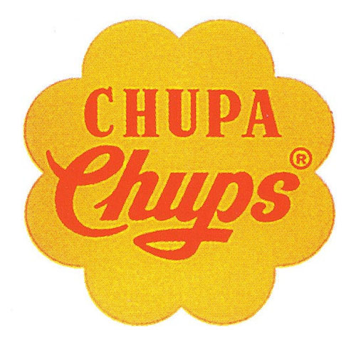
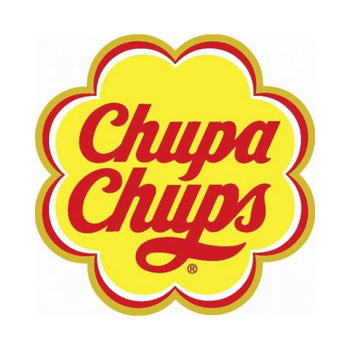
Dalí integrated the wordmark using elegant letters in a daisy. He also added an extremely smart feature to the design: very aware of good presentation, Dalí insisted on putting his design on top of the lollipop instead of on the side. This way, the logo was always fully visible.
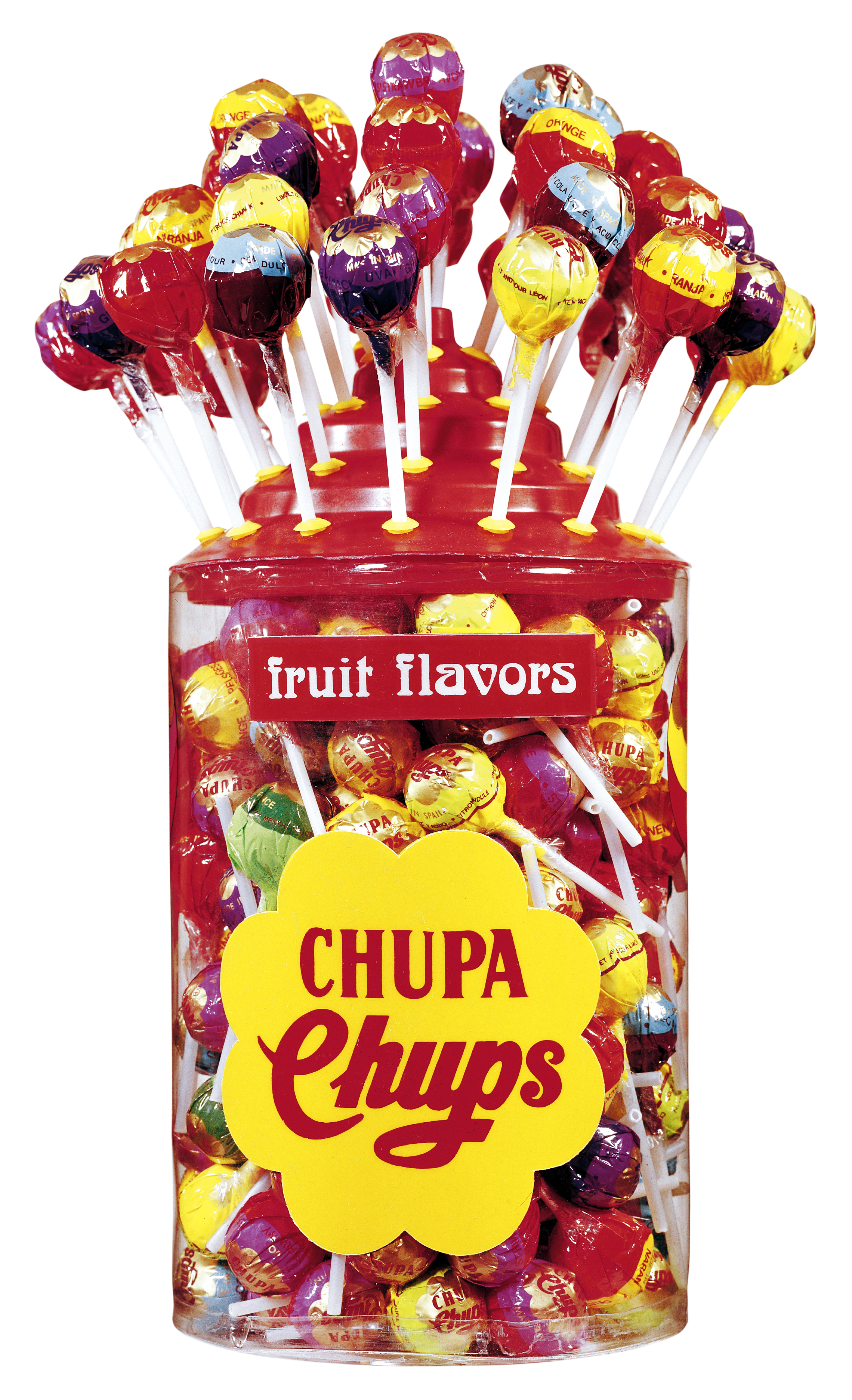
The brand Chupa Chups is still going strong, selling four milliards of lollipops every year.