English
 Nederlands
 Deutsch
 Belgium
 Français
 Español
How important is a font in a design? It is important to know every graphic designer. With a font you communicate intuitively, at first sight, just like a photo.
The origin of many letters is in the handwritten, calligraphic script. The pen has a wide point, and in the curve like an S shows a narrowing, which still features in present day print work.
 Hand-painted letters
The fact that there are still real literary artists producing perfect handwritten / painted texts, as can be seen on this Dutch website: letterhand.com Keeping your Logo authentic!
 Different styles of fonts
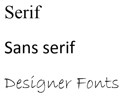
A simple explanation of fonts
• Serif: The letter has a horizontal dash where the letter is "rested". This font is readily readable. For longer readers (in books), often written letters are used. Examples: Times New Roman and Georgia.
• Sans-Serif: A typeface without serifs has no horizontal bar at the bottom and looks more modern. For reading texts, introductions and captions, you can use this letter perfectly. Examples: Arial and Calibri.
• Designer Fonts: Is less about readability and more about the individuality of the character.
The influence of a letter
The effect through fonts on the content of the text has been investigated. Scientists allowed two groups of people to read an instruction for a fitness exercise: one group in a handwritten font, the other group in Arial. What was the outcome? The group who had read the exercise in Arial thought the exercise could be performed in 8 minutes and 12 seconds, whilst the group who had read the handwritten exercise expected the exercise to be completed in 15 minutes and 6 seconds.
The conclusion was: An easily legible font is more easily absorbed by your brain (cognitive fluency). Therefore this test group thinks the exercise is considerably faster than the other test group. As with colors, people have feelings and associations with fonts. The choice of your font thus affects how people experience the content of your text. It is worth keeping this in mind any text related design process.
Source: Crazyegg
Logo design
Of course this will also depend on whether you have a logo, a word mark or a combination of them as a logo. With a word mark, the choice of font is of course important. The combination of figurative mark and word mark means that font and image match. If you have your product or service in your name in addition to your company name, you can choose between two different fonts. The name of your business is most important, but your product or service must also be legible. A logo must last for years. Have your eyes ever been drawn to a unusual trendy font? Then use it in your communication tools, but maybe not in your logo!
Have I inspired you to read more about calligraphy, check out here: www.smashingmagazine.com