The History of the Apple Logo
The Apple logo is world-renowned with billions of people who recognize this at first glance. But who designed the logo and where does the logo originate from anyway? There are many stories about the origin of the apple with the bite out.
One version is that the Apple logo refers to the life of Alan Turing. Turing was born on June 23, 1912. He brought us the basics for today's computers and encryption. Now he is particularly famous for cracking the Enigma code, a cipher used by the Germans during World War II to send secret messages.
Turing’s recognition for his work was not actually till years after the war, on June 7, 1954, when he committed suicide by taking a bite out of an apple filled with cyanide. According to this story Apple's founders their quest for a logo was inspired by Turing’s fatal event. So as a tribute to the man they chose with the bitten apple, nice story, but not true.
Adam, Eva and Newton
But there are other theories. So Apple could the symbol be the of the story of Adam and Eve. According to the Old Testament Adam and Eve where in the Garden of Eden and God told them they could eat everything except the fruit on the Tree of Wisdom, however a snake tempted Eve to do so.
Prior to that bite they were innocent and not ashamed for their naked bodies. But by taking a bite out of the apple they got more wisdom, knowledge and she suddenly felt ashamed indeed. So the Apple represents wisdom, but also the first human sin.
Another nice story to which the Apple logo is not inspired would be based on the falling apple which landed on Sir Isaac Newton's head, which gave him the first idea about the concept of gravity. Supporters of this theory makes regularly that Apple PDA "Newton" was called. But this only came many years after the creation of the logo on the market.
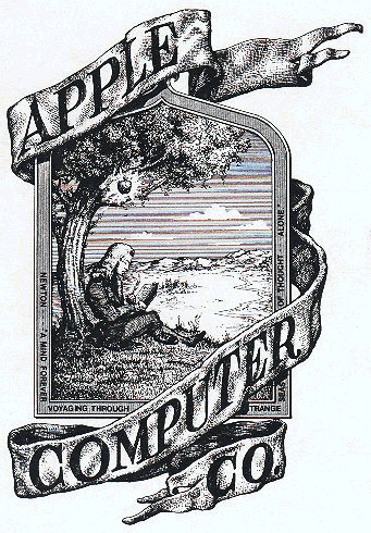
There was also once a logo that looked very different, a kind of engraving of a man under a tree. This was indeed Sir Isaac Newton sitting under a tree with an apple. It was designed by Ron Wayne, one of the three founders of Apple. He hid his initials in the grass and around he wrote knew the slogan "Newton ... A Mind Forever Voyaging Through Strange Seas of Thought ... Alone." Wayne's logo was outdated and Steve Jobs also demanded that it was changed within in a year. Therefore Newton could never have been the inspiration for the logo.
Bite!
Another theory: the bite, or bite in English, represents the bits and bytes to where are computers calculated...
What is the truth about the Apple Logo?
The Apple logo was designed in 1977 by Rob Janoff. In an interview with Creative Bits he says: "I had the bite out of the apple put into the design to make it clear that it was an apple and not a cherry or a tomato. There is something iconic to taking a bite out of an apple. This concept goes beyond cultures. If you've ever bitten into an apple, this is what you get. "Later told Janoff's boss 'byte' was a computer term. Janoff liked this, but more than a coincidence.
 The rainbow colours of the original logo was the decision of Steve Jobs. Initially Janoff presented two logos: one with only one colour in it and one striped. "Steve liked the idea because he liked it as it was something different. Now it is not so revolutionary, but then it was very different. " Incidentally, these colourful stripes partly inspired by the hippie culture of the time. "But the main reason for the stripes was that the Apple II, the first computer for home who could reproduce images in colour on the monitor. It thus represents the colours on the screen. “I also wanted to make the logo appeal to everyone, especially for young people, so Steve could put computers in schools” Janoff claims.
But where does the idea of an apple from? The answer can be found in the biography of Walter Isaacson: this was during a period that Jobs only ate fruit. In the English edition of the biography we read: On the naming of Apple, he declared he was "on one of my fruitarian diets." He Said he had just come back from an apple farm, and thought the name Sounded "fun, spirited and not intimidating. "
The real story about the Apple logo is actually not very exciting. In fact, Steve Jobs had fairly little to do with the process. Janoff, "Funny that the only direction we got from Steve Jobs:" Do not make it cute. "

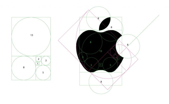
For graphic designers, it is interesting to see which template is the basis of the Apple logo design. This basis demonstrates the consistency and balance you experience in the logo. An interesting interview with Rob Janoff is here.
 English
 Nederlands
 Deutsch
 Belgium
 Français
 Español


