Pop Art and Roy Lichtenstein
When looking for a corporate identity, I advise you to get inspired by art. That’s why I regularly focus on an artist or art movement in my blog.
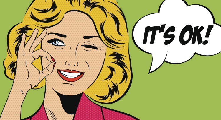
This blog is about Roy Lichstenstein, an important pop artist and part of the pop art movement that emerged in the sixties. His works of art of advertising and comic book images are famous all over the world and once seen forever engraved in your memory. He is known for his figurative works of art, created by big geometrical shapes and grids using big dots. Around 1870 Benjamin Henry Day jr. developed a printing method using small, coloured dots to create an illusion of colour and shading. This method is still used for full colour printing, creating the illusion of a complete colour image by using three colours and black. It was also used in a more simple way by comic books and cartoons, creating a suggestion of depth and shading.
The style of comics
Roy Lichtenstein experimented with cubism, expressionism and abstract art. In the 50s he refined the dotting technique to create American pop art instead of comics. Within this art movement Lichtenstein distinguished himself by using the Ben-Day dots. It’s almost a parody on comics, reinforcing feelings and emotions. You just can’t avoid it!
How to create images like Lichtenstein
Of course, it starts with inspiration. Lichtenstein was inspired by the world of comic books and characters, often using a damsel in distress theme. The subject has to be taken out of daily life and connects the spectator with his own experiences. It continues with a story line, just like when producing a comic book. A story has to be passed on through the work of art. Lichtenstein didn’t create art by producing an exact copy of his inspiration. He tried to magnify it and used a grid to pass on depth and intensity.
With our modern digital techniques, grids may not be relevant, since almost everything is possible using digital images. But just by simplifying an image and limiting yourself, you can invoke the intense experience of Roy Lichtenstein’s style. Maybe this is a reason to once again use simple shapes and grids in images? Purists can return to the drawing board and cut out dotted celluloid shapes and lay them upon coloured squares.
 English
 Nederlands
 Deutsch
 Belgium
 Français
 Español


