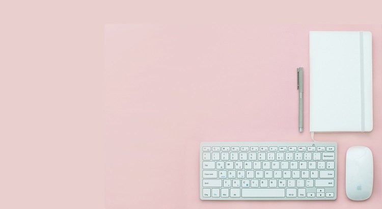
Minimalism: 'less is more'
A growth in technical possibilities in the ‘digital area’ resulted in people automatically using state of the art tricks more often. A counter movement was inevitable. In the meanwhile, a lot of websites have returned to the roots of user-friendliness: minimalism.
Minimalistic websites
Minimalistic websites reduce the use of graphic elements without undermining functionality. They stand out from the rest by using simple fonts and creating large spaces between website elements. Colour use is minimal and reduced to simple black and white images and less saturated colours. Only the essence of the story is depicted.
The advantages
Besides providing crystal-clear communication, minimalistic websites have many other advantages. Using a limited number of elements puts less pressure on your server connection. A limited loading time is essential to a good user experience. It also helps maintaining your websites. Since minimalistic websites are simpler, it’s easier for visitors to absorb information. If you want to focus someone’s attention on something particular, a bit of colour or a slight layout change makes a huge difference. Minimalism doesn’t have to be boring, deprived of every form of creativity. Simplicity ensures a balance. You might think it’s easier to design a minimalistic website. This is not the case. A skilled graphic designer operates in the same way as an architect. He creates a solid grid, providing solutions for problems that may arise in the future.
Even though I only discussed digital communication in this blog, the same rules and advantages apply to printed communication. I’ve written before about the influence of typography on communication. The more minimalistic a website is, the more important typography is!
Looking for an example of a minimalistic website? Take a look at Apple, modelling agency Elite or shoe brand ETQ.
 English
 Nederlands
 Deutsch
 Belgium
 Français
 Español


