English
 Nederlands
 Deutsch
 Belgium
 Français
 Español
The three main factors of a Font: readability, how economical is the letter with space and what does the font in your subconscious give? A few fonts are used extensively. It is true that many letters have been going on for decades, in some cases for centuries ...
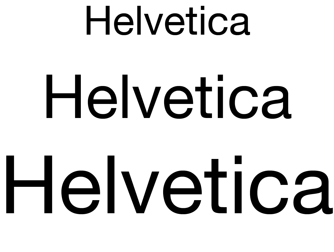
Helvetica
One of the most popular fonts for decades is Helvetica, designed in the 'analogue era', around 1957. Actually could be thought of a bit of boring letter, but today it is still a popular font in the typographic world. This is due to its minimalistic neutral character, typographic properties and readability. It is a scriptless (sans serif) font designed in 1957 by Max Miedinger and Eduard Hoffmann for the Haas'sche Schriftgießerei.
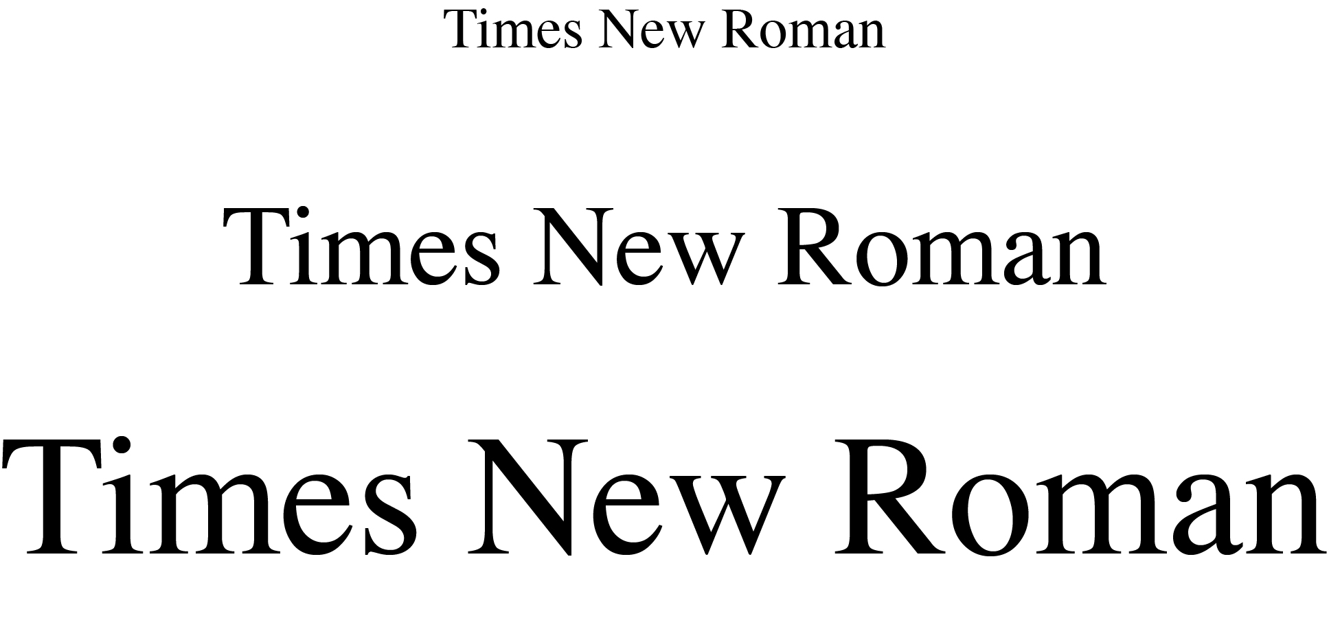
Times New Roman
This is the most commonly used font. It was a standard font for many software’s and was designed for British newspaper the Times in 1931 by Stanley Morison. Although Times New Roman is no longer used by the newspaper itself, the font is still popular if you have "something weighty" to write. Because font is so easy to read.
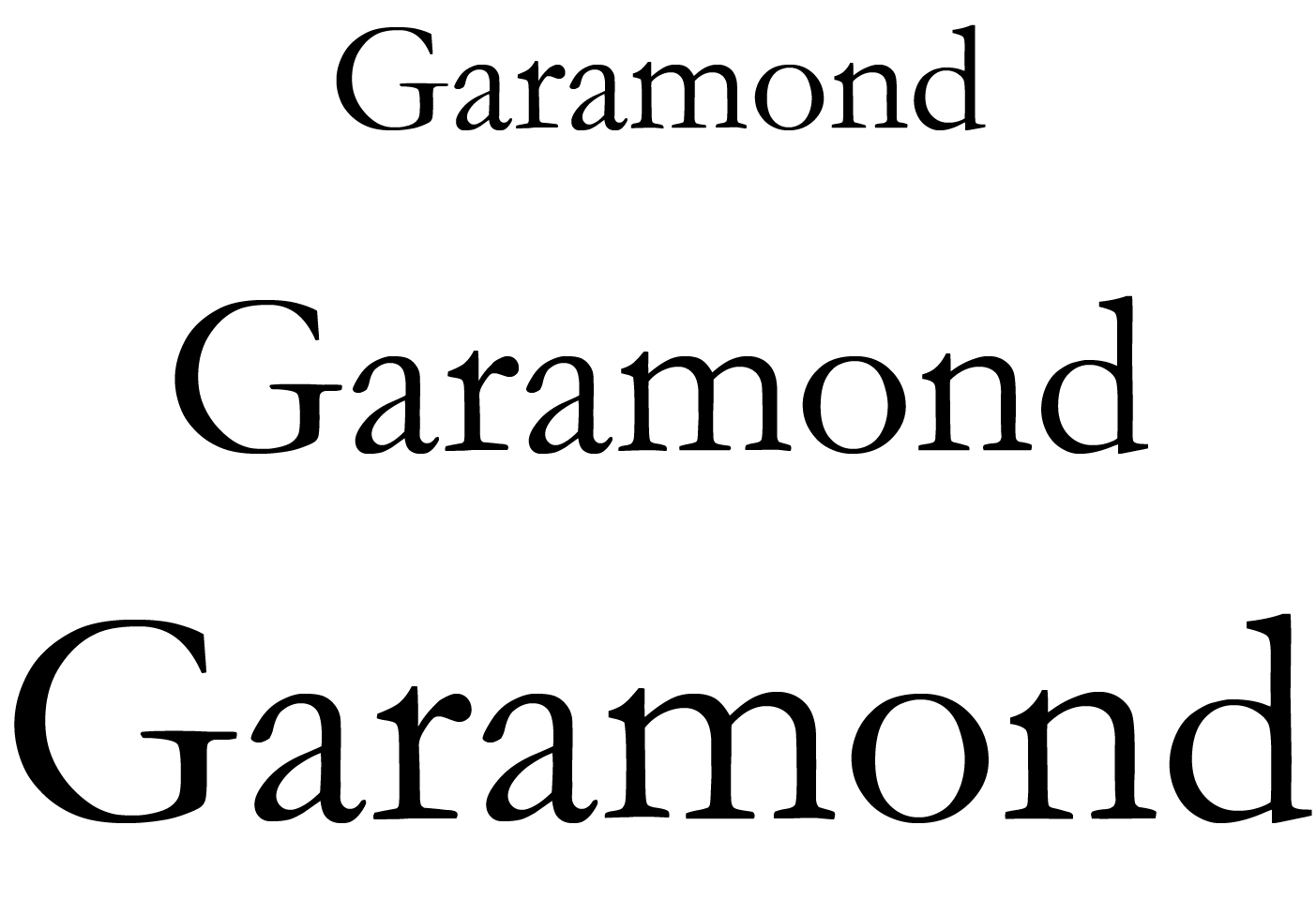
Garamond
This font began as an assignment in the name of the French King Frans I around the year 1540. The font has the name of its original designer: French stamp cutter Claude Garamond. The font is especially suitable for longer texts, such as textbooks, magazines and websites. Frankly, I find this font, however written, much nicer than the Times New Roman. The font is much more gracious, especially the cursive letter. Do not forget to use this too!
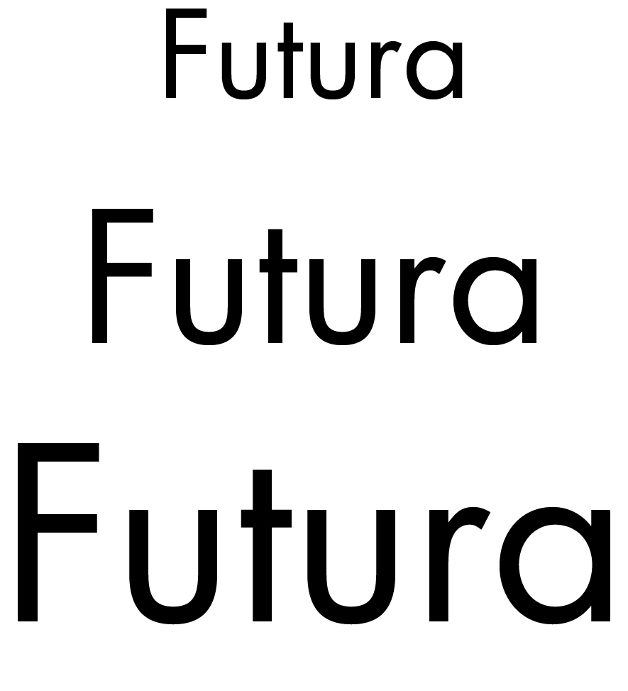
Futura
Designer Paul Renner was inspired by the art style Bauhaus in 1927 and created a business and essential font. Futura was made on behalf of Bauer foundry. Futura can be found in house styles and logos. For example, Volkswagen and Shell use the font in their print. Futura is a geometric writing less font which Renner believed this font type he would express modern times, which is certainly true as this image still uses this font.
Bodoni
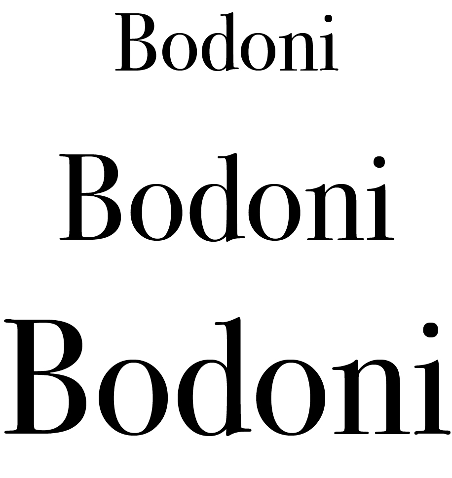
This is the Lamborghini of the fonts, a true classic! Designed or will we say in this case, cut by Giambattista Bodoni (Saluzzo, February 16, 1740 - Parma, November 29, 1813) Italian engraver, publisher, and letter designer. Bodoni was appointed in 1768 as a printer at the Parma ... His name lives on in this font designed by him.
Bodoni introduced the technical improvement of typography. His style has many admirers, he is the champion among classical typographers. Bodoni's letter designs have a big contrast between thick sticks and thin scripts and arches. This letter is suitable for both plain texts and decorative heads.
Frutiger
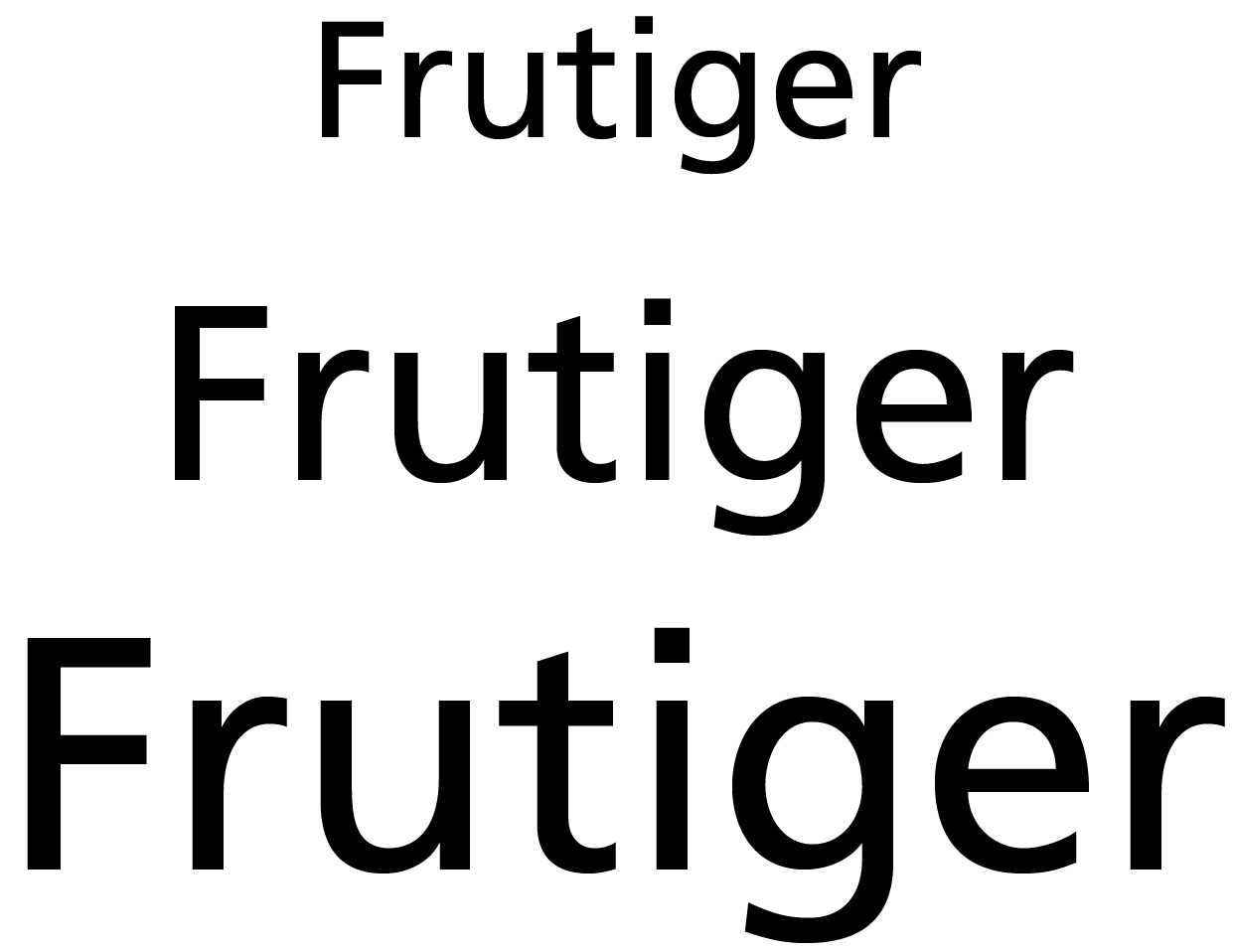
This font looks similar to the Futura, but is more graceful. The font was designed in 1975 for the French airport Charles de Gaulle. For use at the airport, it was important that the letters be readable at different angles and at long distances. The letters are easy to distinguish with clear sticks and openings.
Comic Sans
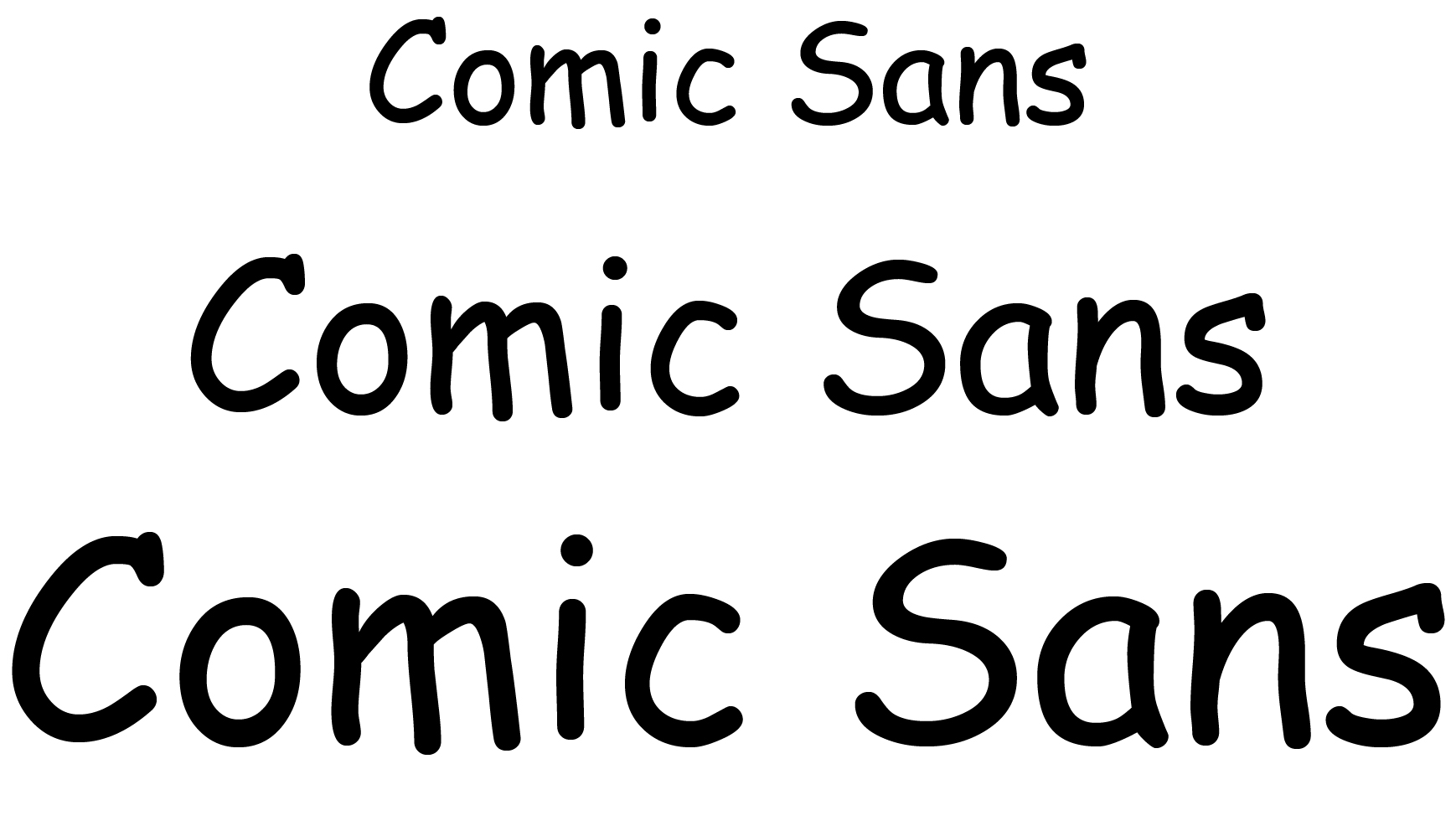
Comic Sans is the most hated font by professional designers. It is the only font for which multiple hate websites exist and there was also a Comic Sans day several times calling everyone to work in Comic Sans as much as possible. This font is recognizable by the childish handwriting that was widely used in the beginning of the Internet to get an alternative, relaxed look. If you use this font you will not be taken seriously anyway ...!