How to go viral on Instagram?
Instagram is full of pretty pictures. A beautiful photo is what it’s all about. But why do some posts get so many likes, while others disappoint? It’s not that simple, you can’t just say “good images succeed, bad images don’t”. Even amazing pictures can fail completely. A couple of suggestions on publishing on Instagram.
Do-it-yourself
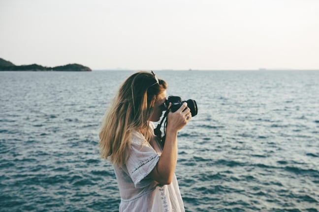
Everyone that regularly posts something on the internet, knows that visual representation is a necessity. Bringing in a photographer or taking pictures yourself is the best option if you’d like to post authentic material. You might know the saying: “a picture is worth a thousand words”. I personally think it’s more profound than just conveying information. The reader/viewer is intuitively influenced by images. The image provides information about the historical context and the underlying intention.
With the current technology, it’s really not that difficult to shoot nice, authentic photos yourself. I take a lot of pictures with my iPhone and I’m surprised by the quality every time. The advantage is having a camera with you at all times when something interesting emerges. Be creative: change your perspective, take a look at the world through the eyes of a child.
Simplicity
It starts with simplicity. The main rule for every strong picture. If you only remember one thing from this blog, it would be that simple images perform well on Instagram. Take into account that images on Instagram are mostly viewed on small telephone screens. Visually complex images are more suitable for hanging on the wall. Simplicity does not mean it’s easy. It’s nihilism, looking for the essence, peace and balance.
Cropping
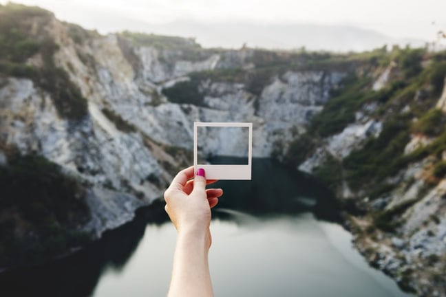
A weak image can often be fixed by cropping it. You can also apply this on images of persons. It’s “the art of omission”. By cropping a picture, you can go back to the essence of what you are trying to convey.
Be exciting
The rule of thirds applies in visual imaging. It recommends that if you draw a grid of 3 x 3 on an image, the subject should never fall in between these lines. It’s not a law you should blindly follow, but it reminds you to create tension within the image. Don’t centre every subject and don’t show the whole subject. Another way to be more exciting, is by on purpose cropping out an image at an angel. You either position the horizon horizontally or at an extreme angle (of at least 15 degrees). Don’t go in the middle, otherwise the result may look like an unsuccessful picture. This method works especially well taking action shots!
Height and width ratio
The possibilities to play with proportions on Instagram are limited, but you can use this suggestion on Facebook. A landscape will be extra ‘wide’ with a panoramic cropping: a kind of super widescreen. A tower will be extra high after a vertical cropping. Peace and balance will come after cropping the image in a square. The possibility of a round shape is sometimes forgotten when creating the graphical layout of printed products and websites.
Portrait
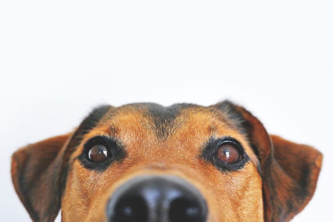
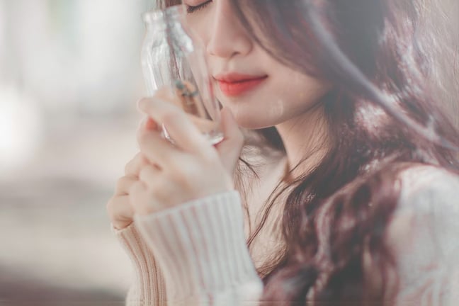
You don’t have to show someone’s complete head or body when making a portrait. Showing only a piece of someone’s head will be more exciting and more attractive. It’s a subjective matter, but you will make the picture a lot more intimate.
Colour
There has been research into which dominant colours perform best on Instagram. It appeared that blue pictures perform 24% better than red or orange images. The less saturated colours, the ‘urban look’ also does well.
 English
 Nederlands
 Deutsch
 Belgium
 Français
 Español
