English
 Nederlands
 Deutsch
 Belgium
 Français
 Español
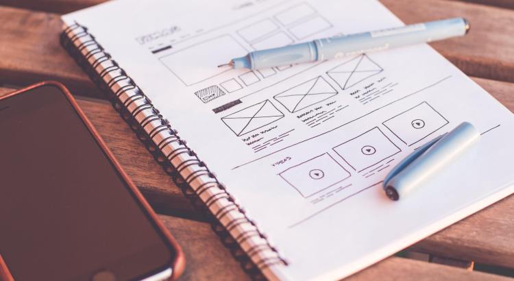
If you want to create a design or an image for blog posts, social media or online ads, you do not need to obtain a graphic design degree. Of course not everyone has the same feeling for it, but the funny thing is that rather an authentic design or image, a super smooth ironed design or a slick picture is preferable. That is because with an authentic design the message is more credible and therefore more convincing.
For example, there are many websites where you can download ready-made images. Unfortunately, these types of images often give the impression that you have an average company based in the USA...
Here are a few tips which can help you to appear more professional with your own material.
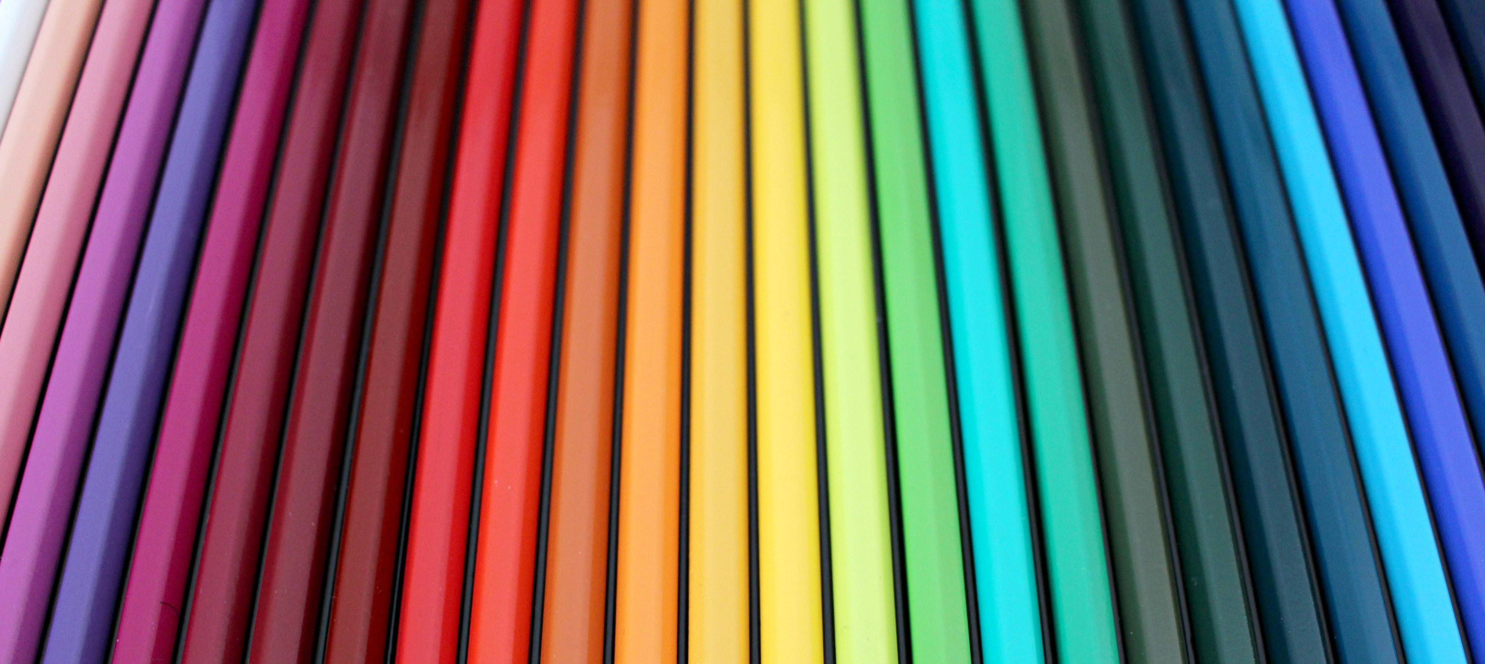
1. Color palette
Have you noticed that the best and most striking designs have a sophisticated colour scheme? That is no coincidence, a good colour scheme is one of the keys to a great design. If you want to stand out, use bold colours, but do it differently than the competition! Before you start worrying about choosing your own colours, click here and visit a professional Adobe site where you can experiment to your heart's content. Pinterest is also a great source of inspiration!
2. Fonts
Ideally, you should limit yourself to 1 or 2 fonts. If you are going to use multiple fonts, use one for the header and another for the main text. For more inspiration, please refer to my previous blog on fonts and how to use them in terms of styles in different situations
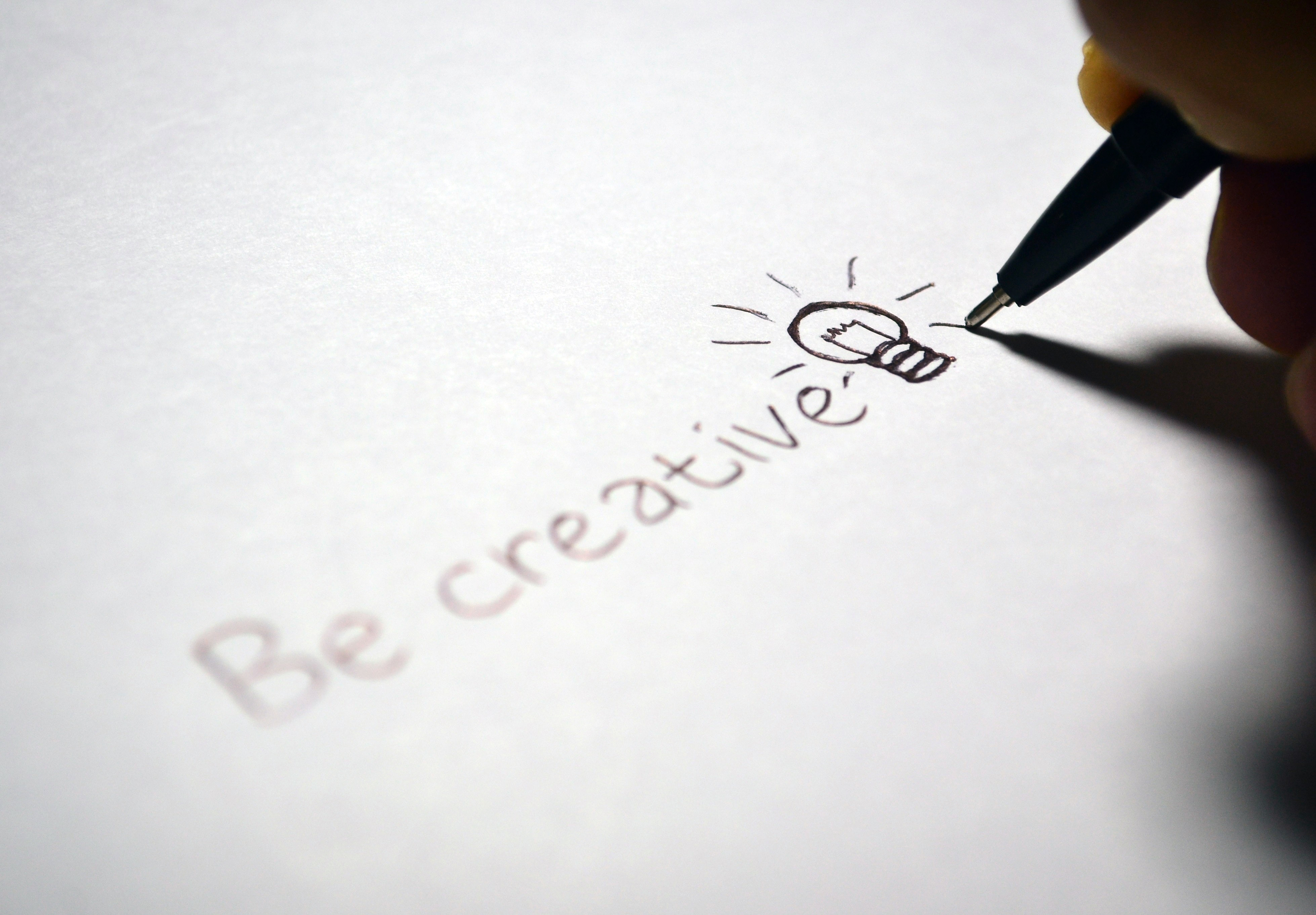
3. Source of inspiration
There are few designs and photographs that are truly authentic. We are all influenced by each other as to what is beautiful and ugly, good or bad. The revolutionaries among us were also looking for inspiration. Steve Jobs searched it in calligraphy. Van Gogh looked at Japanese prints. Picasso looked at African masks.
With the ancient Greeks, a source of inspiration was considered divine in nature, symbolized by the Muses.

4. Space
Do not be afraid to leave blank or white space in your design. As one says, less is more ... Try to limit yourself to the essence. Sometimes designs are so cluttered that a white space will really improve the design. This may require a bit of a mental adjustment from your side. But with the right change you can use this concept to improve your design.
5. Alignment
Alignment helps to keep design elements in a presentable order, regardless of their different dimensions. Good alignment is an effortless way to give your images and text a refined and professional look.
6. Icons
Icons are like black pepper. They can be scattered figuratively on top of every design you are cooking. The icons add extra pizzazz to your design and ensure that it 'tastes good'. You can of course design your own icons, but that is tricky then there are icons in many styles easy to find on the internet.
7. Design Rules
Rules, which rules? The Rules you set yourself! These will probably not be specific rules. But rather choices in your design where you use a certain set of colours, lines, textures, etc. This creates a rhythm. Stay consistent with your 'design rules', the people you like will appreciate it.
8. Contrasts
Rules, which rules? The Rules you set yourself! These will probably not be specific rules. But rather choices in your design where you use a certain set of colours, lines, textures, etc. This creates a rhythm. Stay consistent with your 'design rules', the people you like will appreciate it.
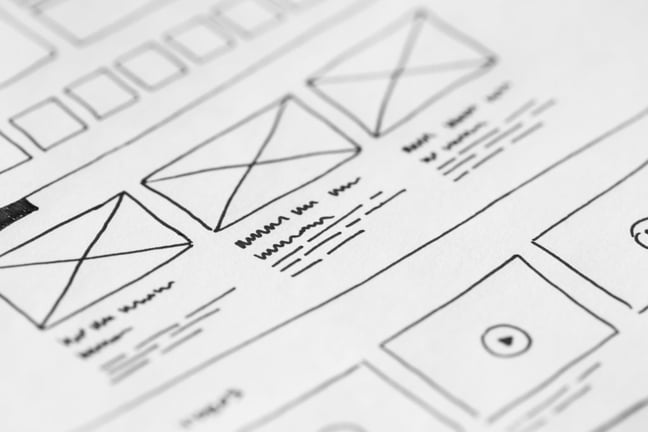
11. Lines and frames
Lines and frames help to anchor items in an image, and create the feeling that there is an overall order. Use lines in your image by placing them in blocks of text. You can also place lines as 'separator' between different elements in the image. In the latter case, the feeling of elements that is separated reinforces the sense of planning and coordination in the design.
12. Style
Think about who you are designing for. Usually one designs for a specific audience. Are they children, men, women, what is the age category? This ensures that you meet the intended target group and that they will respond positively. Keep it simple: Think of a movie like superhero movies and sci fi-epics that have too many special effects. Too many explosions, too fast spaceships, giant robots, and so on. After all, you have quickly forgotten all the noise. It is the same with a design. If you overdo it with too many special effects, such as shadows and colour transitions, it is usually too much of a good thing.
Conclusion
As you can see, graphic design does not have to be difficult. Just follow these tips and you are well on your way to make great authentic designs and photos.