English
 Nederlands
 Deutsch
 Belgium
 Français
 Español
A graphic designer has a wide range of possibilities to put the finishing touch on a product. Clients are often not aware of this and take everything as it comes. To inspire everyone to produce a beautifully finished product, this blog is about print refinement.
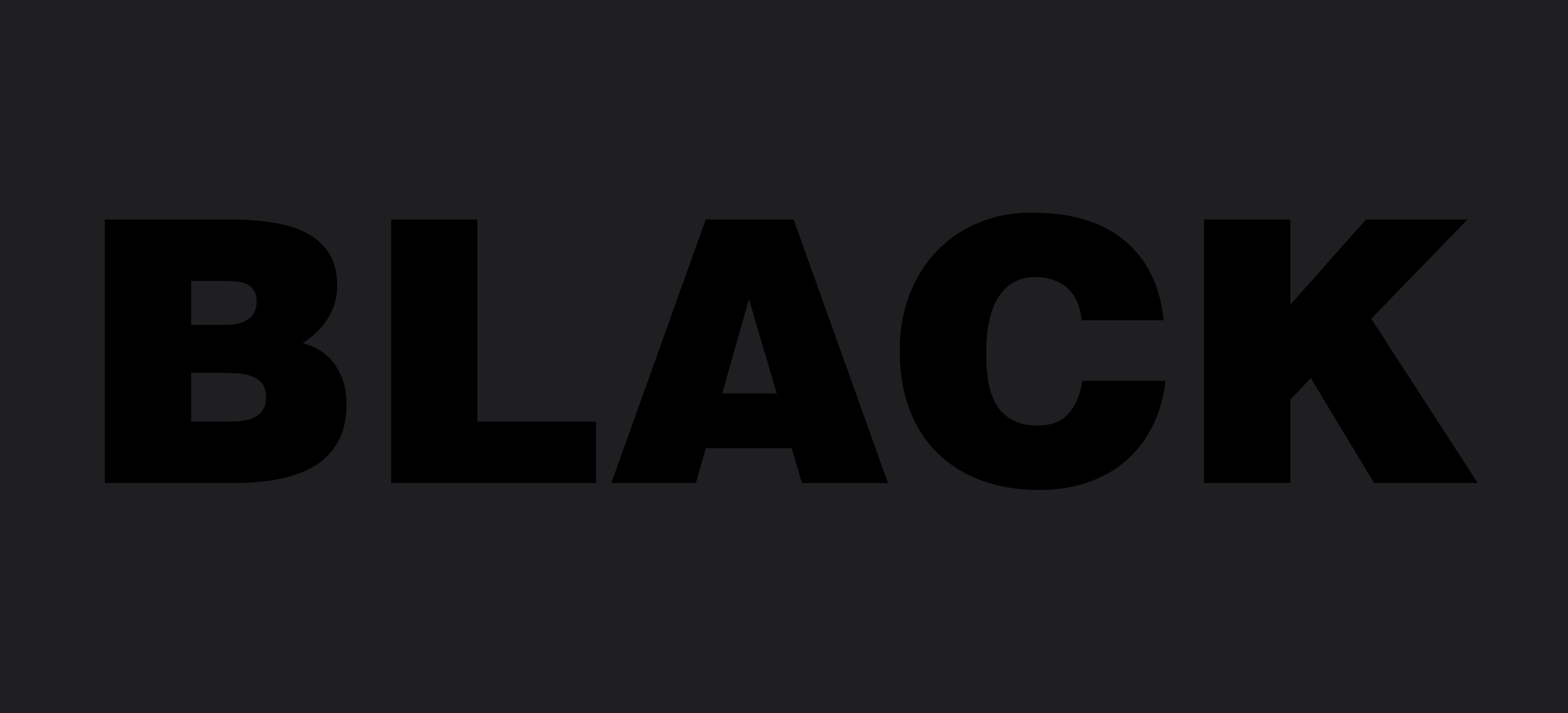 Black over black
Black over black
This is a method to create a deeper kind of black. In full colour printing, you can choose to print only black, resulting mostly in dark grey, since a lot of the ink will dissolve into the paper. Texts can be printed best in black, since it results in the sharpest result. To print deep black illustrations and headings, it’s better to include the other CMYK colours. A good solution is using C=60%, M=50%, Y=50%, K=100%. Printing ink is transparent, so you won’t notice these colours, but they will result in a deeper shade of black. You can experiment with this, but keep in mind that the sum of the CMYK values shouldn’t be higher than 280%.
Spot varnish
Another way to stand out is using varnish. This is mostly used anyway because the ink otherwise spreads. Using spot varnish, you partially apply varnish as an illustration on a page. It results in a subtle matte and glossy finish.
Fifth colour
With CMYK printing (full colour printing), the colour intensity is often restricted. The colours are not all that great: orange looks more like beige and purple and turquoise are also difficult colours. This can be solved by using a fifth colour. You can, for example, add an orange Pantone colour to reach a stunning result.
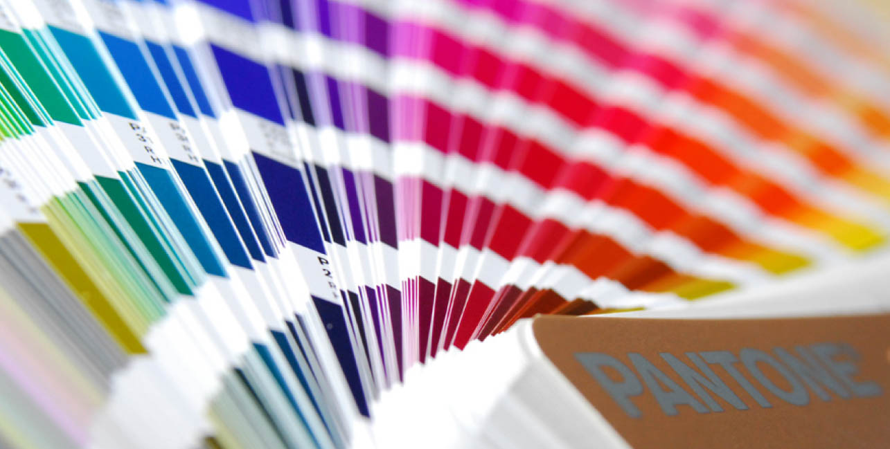 Pantone Farben
Pantone colour
Remember that you only use three pigments and black in full colour printing. It’s a bit of an optical illusion: using little dots, your try to show all the colours of the rainbow. Pantone colours make a difference; you will use not less than ten pigments!
Vernis, UV lacquer, laminating
Print refinement: a nice term that indicates what varnish, UV lacquer and laminating can do in printing. Varnish can be applied on a press, making it a cheap solution but one with a limited result. UV lacquer is applied by screen printing. There are many possibilities: much more than only glossy or matte, what about Christmas cards with glitters? Laminating is most sustainable and useful when the product can become dirty. With print refinement, you can choose from matte or glossy. Matte has a subtle result, but fingerprints show easily. Glossy results in intense colours and reflects.
Silver and gold
Silver and gold are also printing inks and exist in many variations. What about a copper colour, dark gold, yellow gold or RVS silver? You can’t expect to see your reflection. To reach this result, you have to use the following techniques.
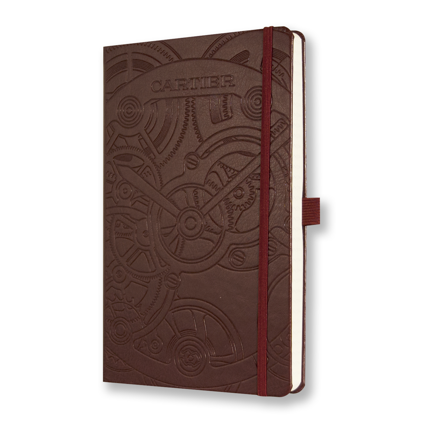 Notebook with debossing
Foil print with debossing
A foil print that actually reflects: print refinement at its best. Many other colours and effects are possible. Because a cliche is being produced, it’s also possible to do a debossing for the same costs. In that case, the paper is being pressed into the book. This can also be done without the foil or with a transparent matte or glossy foil.
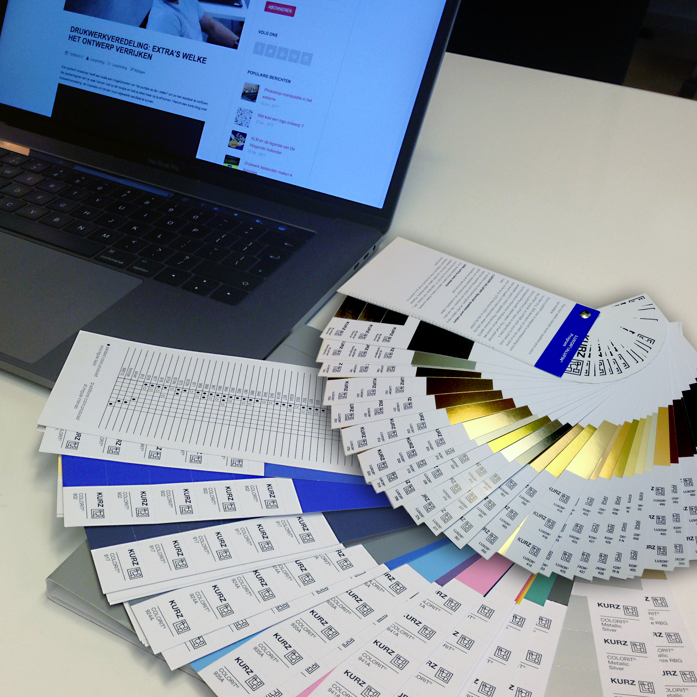 Colour wheel for foil printing
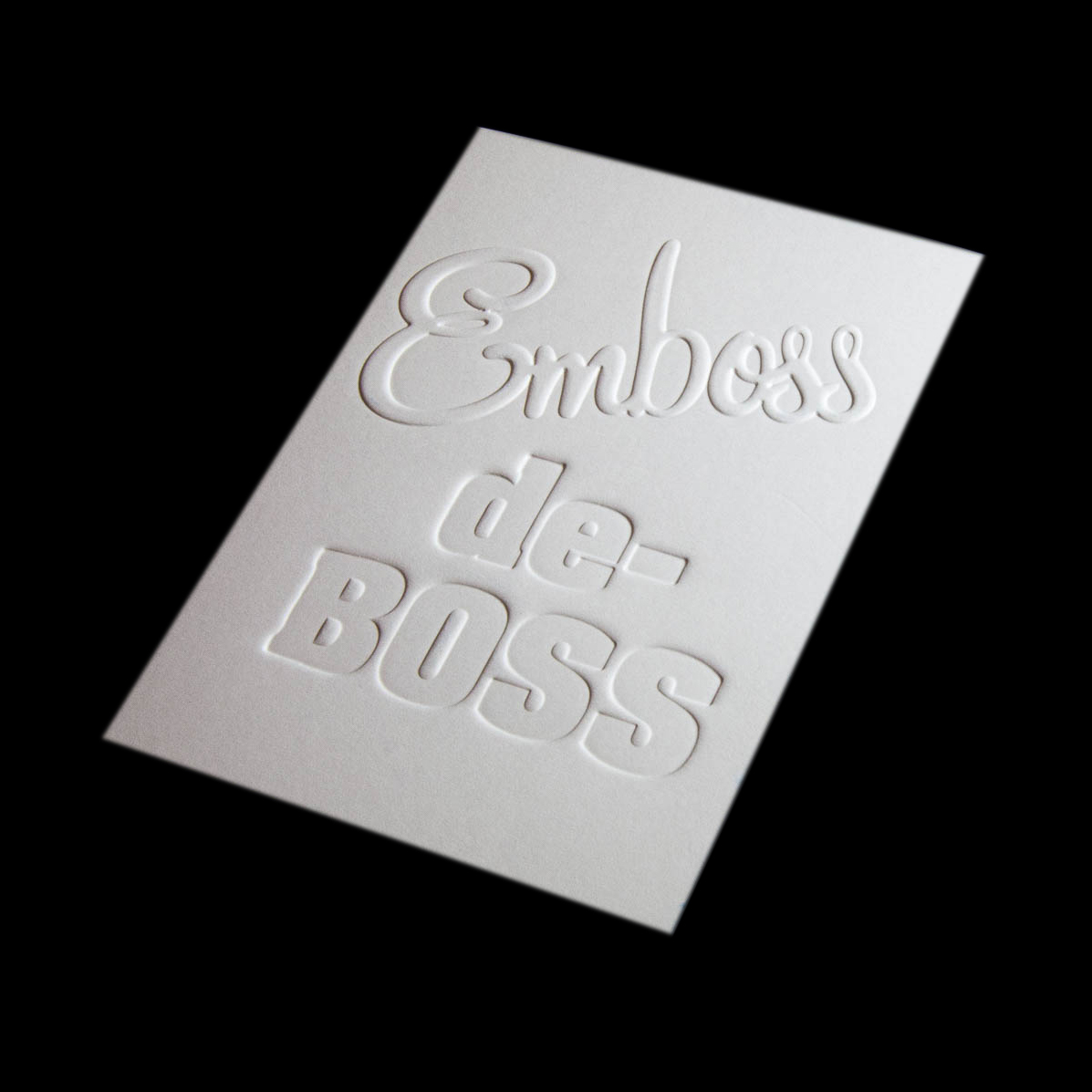
Embossing and debossing
This is pressing paper down (debossing) or up (embossing). A cliché must be made and that gives starting costs. This cliché is kept so if you order a reprint you will no longer have these costs.
Die-cut, creasing, perforation
Using a die cut, you can cut out products. There are a lot of possibilities, but not everything is possible. Rounding corners is easiest, because the paper should easily come off the die cut. A die will cost money, but it will be saved for possible re-orders, so you only have to pay for it once. You can also choose from hundreds of standard shapes for which you don’t have to pay.
Cutting diagonally
This will ensure surprising results, especially in combination with creasing. Printing isn’t all about squares!
Creasing
Creasing can be executed in many variations. I often first fold a model which I use to sketch on. It gives me some guidance and a more creative result.
Binding
There are two ways to bind: glued or section sewn. Using glue is easier, all pages are being bound by a layer of glue. Section sews books are more traditional and workable: all sections are held together by thread. It gives the book a classic look. Binding is quite a profession. I’ll write another blog about this subject soon.
Personification
Using digital techniques, it’s possible to personify products by, for example, using the name of the recipient. The client handles the product more carefully and the message comes across better.
Paper
There are several kinds of paper, with different looks. To compare, think about clothes: a gentleman can wear a suit or jeans and a t-shirt. The choice of paper also depends on the press and further finishing. It’s “the icing on the cake”!