English
 Nederlands
 Deutsch
 Belgium
 Français
 Español
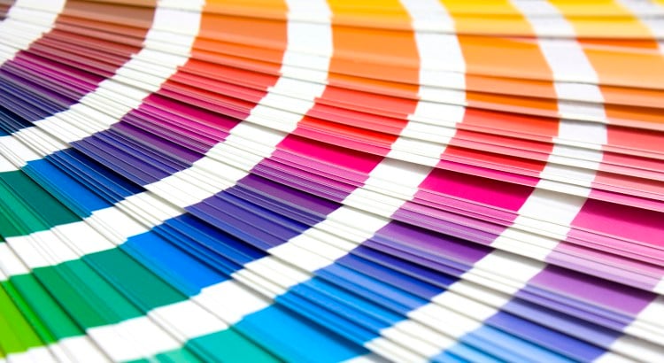
Pantone Inc. became famous by selling the Pantone colour. Before the company introduced their Colour Matching System (PMS) in 1963 there was no colour standard in the printing industry. Pantone originally produced colour charts for cosmetic companies. In 1962 employee Lawrence Herbert bought[...]
nieuws-en

A designer often looks differently at objects than the average consumer. He will be more critical, but also sometimes astounded. I experienced this recently when I came across a video about hydrodipping on Facebook. My first thought was that it looked like magic!

A growth in technical possibilities in the ‘digital area’ resulted in people automatically using state of the art tricks more often. A counter movement was inevitable. In the meanwhile, a lot of websites have returned to the roots of user-friendliness: minimalism.
In a short while, Photoshop will introduce a new feature: a way to copy the visual aesthetics from one photo to another.
The Dutch East India Company was the first multinational and back then (now centuries ago), already in possession of a recognisable logo! The origin of companies using a logo goes back at least two millenniums: the Greek and the Romans printed stamps on their pottery products to recognise who[...]
It started last year with a simple “hi” on Canal Street in New York… Which then turned into a Post-it war in Lower Manhattan. Copies of Spider Man, Angry Birds and Andy Warhol and several text messages decorated the office windows. Not only in yellow, but in all colours of the rainbow. The first[...]