Auteur: Leoprinting
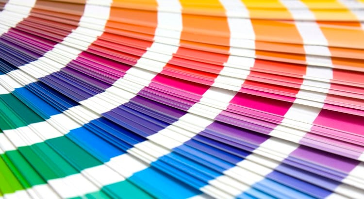
Pantone Inc. became famous by selling the Pantone colour. Before the company introduced their Colour Matching System (PMS) in 1963 there was no colour standard in the printing industry. Pantone originally produced colour charts for cosmetic companies. In 1962 employee Lawrence Herbert bought[...]
A designer often looks differently at objects than the average consumer. He will be more critical, but also sometimes astounded. I experienced this recently when I came across a video about hydrodipping on Facebook. My first thought was that it looked like magic!
A growth in technical possibilities in the ‘digital area’ resulted in people automatically using state of the art tricks more often. A counter movement was inevitable. In the meanwhile, a lot of websites have returned to the roots of user-friendliness: minimalism.
A strong brand, and everything surrounding it, is the holy grail of marketing. What basically is no more than a couple of letters - sometimes matched with a symbol – transformed into a desirable good or service, is actually quite an accomplishment. An icon to which people match their identity. A[...]
Before the digital area, almost anything graphical was designed trough a physical process. In the film and television industry, a lot of logos were also physically produced in order to film them. Some television stations and film studios went even further and designed three-dimensional physical[...]
The Dutch East India Company was the first multinational and back then (now centuries ago), already in possession of a recognisable logo! The origin of companies using a logo goes back at least two millenniums: the Greek and the Romans printed stamps on their pottery products to recognise who[...]
 English
 Nederlands
 Deutsch
 Belgium
 Français
 Español


